

Choosing a palette that actually photographs well
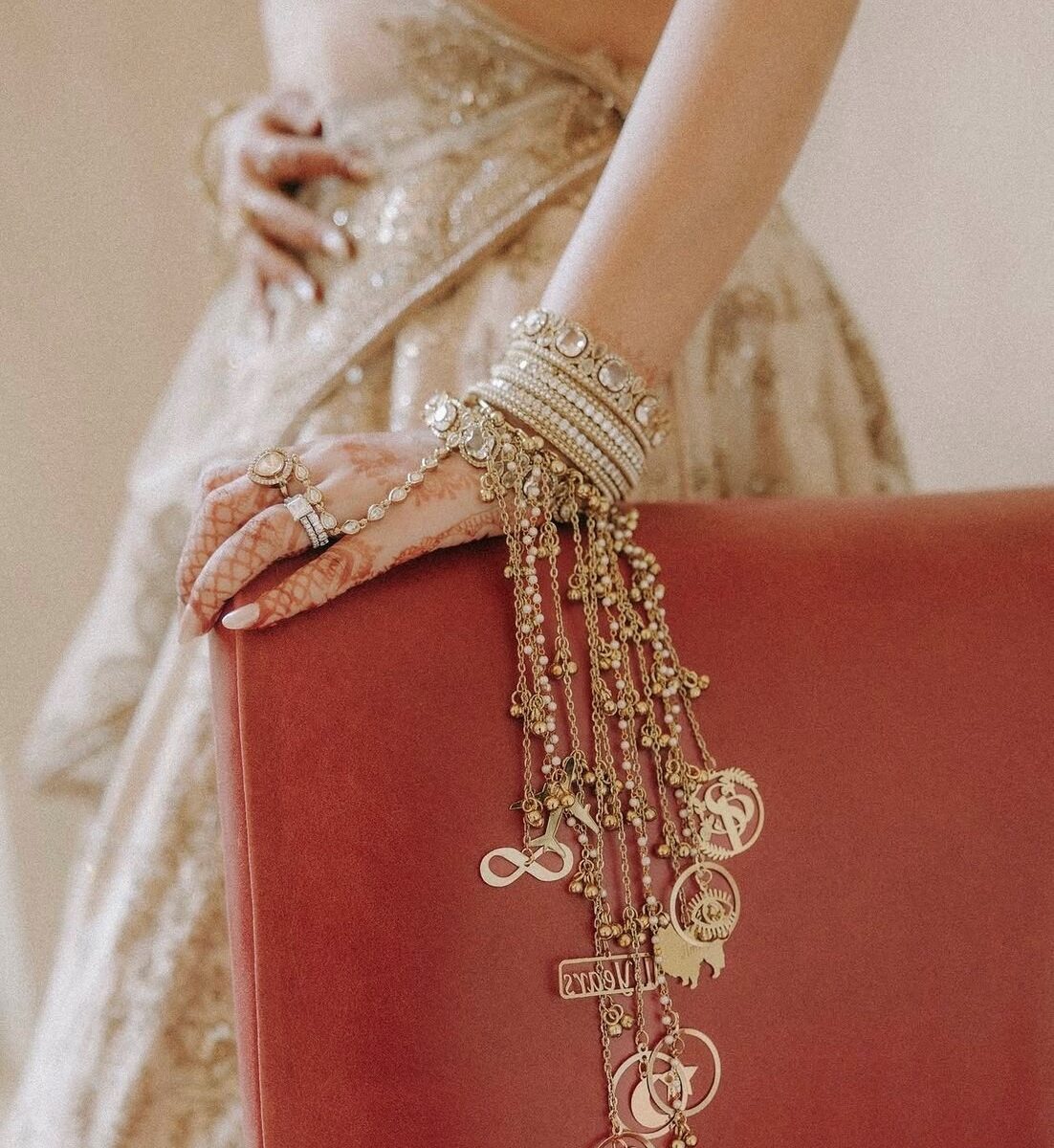
A palette has to work twice: once for the people standing in it, and once for the camera.
Skin tone comes first
Every reflective surface throws colour onto faces. Large expanses of cool green or hard blue will tint your guests in every photograph taken near them. Warm neutrals do the opposite.
Contrast beats saturation
A room that reads as one tonal value photographs flat regardless of how vivid it is. You need a dark, a mid and a light. Our ivory-and-crimson work is really ivory, deep red and near-black — three values, two colours.
Daylight lies
Pastels lose a step outdoors at noon and gain warmth at sunset. If the function is in daylight, saturate one notch further than feels right indoors.
Metallics are a decision, not a default
Pick one and use it everywhere, or use none. Mixed metals in a single room read as unplanned in photographs even when they look fine in person.
Written by Ridhima & Somya
Keep reading
More from the Journal
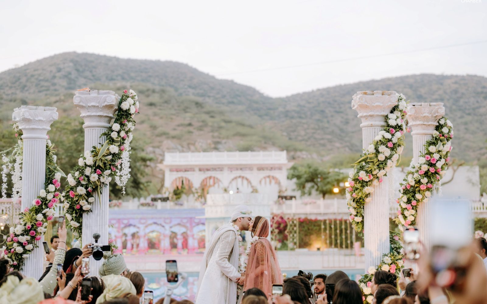
Destination weddings: what nobody tells you about load-in
The design is the easy part. Getting three trucks up a heritage road before dark is the actual job.
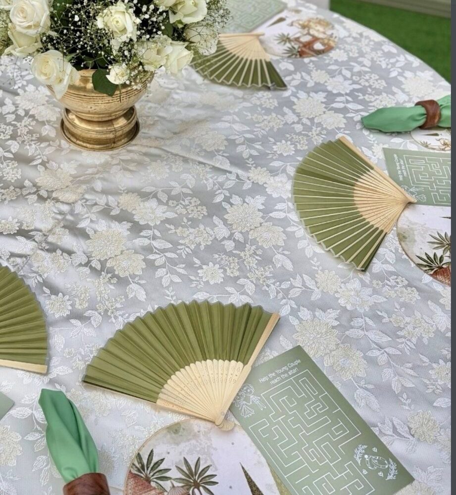
Six months out: the planning timeline we give every couple
A month-by-month sequence that keeps decisions in the right order — and stops the expensive ones being made last.
What a wedding actually costs — an honest breakdown
Where the money really goes, which line items are always underestimated, and the three things worth overspending on.